Throughout the process of constructing the 34th Bienal de São Paulo, its curatorial team, participating artists and guest authors will send out letters with open dialogues that directly and indirectly reflect the development of the exhibition. The text below was written by the Andrade Morettin Arquitetos.
The invitation to write, in the space of the correspondences, about the architectural design for the 34th Bienal de São Paulo led us to reflect on the work process around it and to revisit the reading that we made of the event’s curatorial proposal – which is aimed discussing the relationship between things, much more than the things themselves. A discussion that is centered on the possibility of dialogue – or of mediation – as a way of relating with the world.
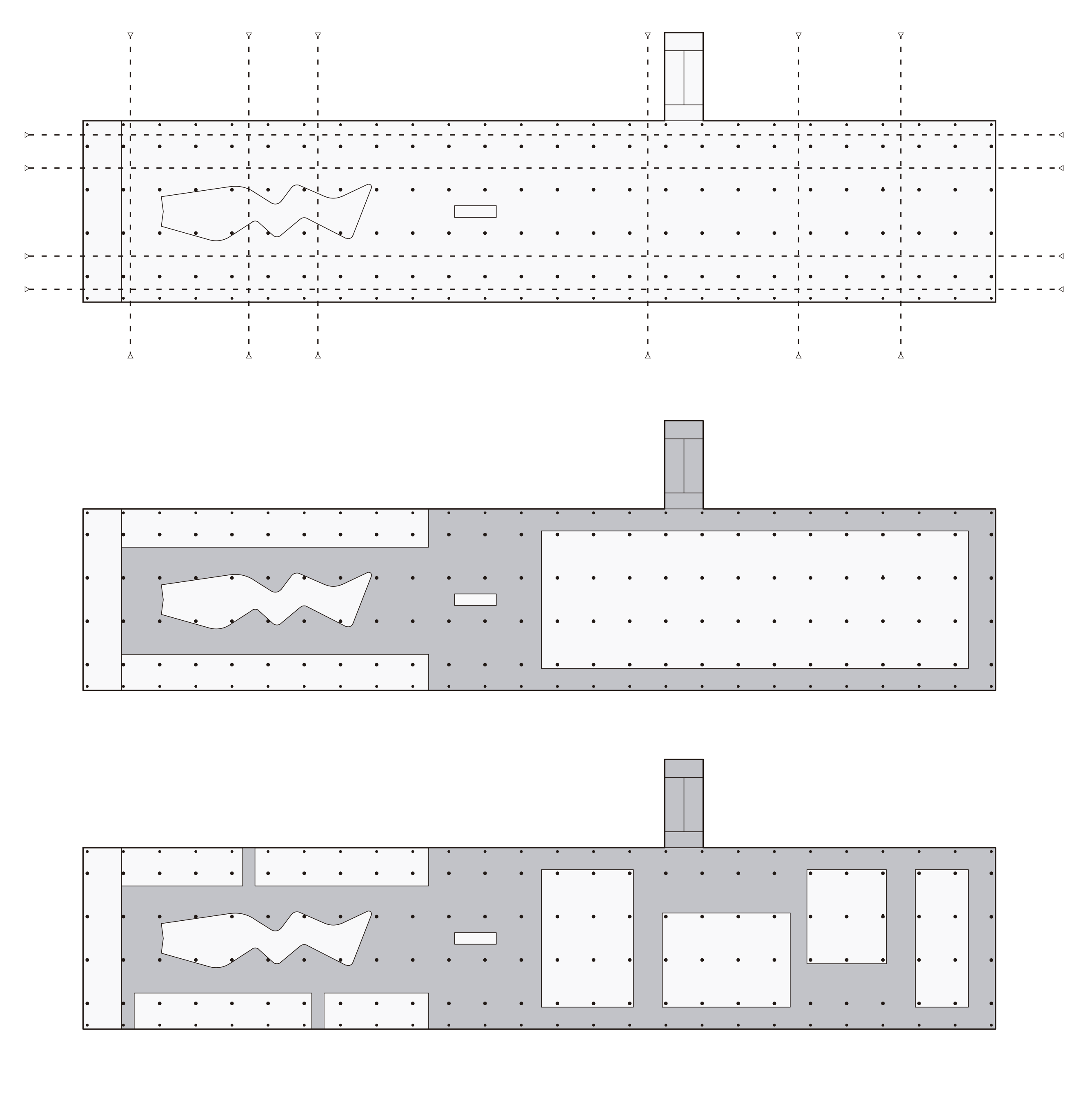
This concept of mediation takes on an even larger meaning when we consider that one of the main questions involved in an exhibition in the Bienal building is its confrontation with the scale of the architecture, its monumental dimensions – remembering that the pavilion, constructed for the occasion of the celebrations of the IV Centennial of the city of São Paulo, in 1954, was designed to house the Palace of Industries. With an urban dimension, the 250 x 50-meter pavilion consists of a series of extensive horizontal planes, structured by a regular grid of columns, connected by ramps and integrated to the surrounding park by its spacious ground floor with its triple ceiling height. Coupled with these characteristics is a brand-new and much celebrated architectural feature: the clearing of the third floor, which was previously occupied by the collection of MAC USP and which now presents its entire free plan to view, with a highlight on its auditorium.
Based on these initial considerations, we identified the relationships that would be interesting to establish between the artworks, the pavilion and the park, with the visitors as a conducting thread. More precisely, we aimed to create, by way of the architecture, conditions by which these relationships would take place in a balanced and modulated way. This goal gave rise to the idea of creating an intermediary scale, to carry out this role.
To materialize this design concept – and considering an analogy with the urban reading that the pavilion suggests, in which its floors are like city blocks – we imagined buildings or galleries distributed throughout its planes, able to configure different levels of containment, visual permeability and lighting control. The galleries mark off a sequence of inner exhibition spaces, with alternating forms and materialities, whose interiors can be flexibly used for the arrangement of the artworks, according to the needs indicated by each artist. The detailed and precise exhibition design was developed by Metrópole Arquitetos Associados.
In counterpoint to the open transparence of the glass façade in relation to the park, we imagined the galleries built with light, prefabricated elements, using support frames of laminated wood and partitions made with panels of various materials. Besides establishing a different constructive repertoire from that of the pavilion, the choice of a system based on industrialized components allows for quicker and easier setup along with more possibilities for the reuse of materials after the exhibition is taken down.
For the “skins” used in making the partitions, we chose a jute fabric that allows for the passage of air and light while also acting as a delicate filter of organic material; sheets of alveolar polycarbonate, which configure a space with diffuse lighting, blurring the lines of sight and visual continuities; and plywood sheets, allowing for more introspective and controlled settings.
Last but not least, as a recovery of the open ground floor originally proposed by Oscar Niemeyer, the entrance to the exhibition is concentrated on its northwest face, next to the marquise. With its monumental design and ample ceiling height, as though it were an extension of the marquise itself, the entrance reinforces the building’s urban character and will serve as a welcoming area while also offering lockers, a bookstore and an educational space, seeking greater integration between the park and the exhibition.

